History of Frutiger Aero

This section is a brief explanation of the history of Frutiger Aero, from its rise to its decline, and the sub-aesthetics that derived from it. For a quick definition of what Frutiger Aero is, click on the "CARI defines Frutiger Aero" section down below. This page will be updated often as I find more information.
Introduction
Before we delve into the history of Frutiger Aero, we need to understand what it is. The term "Frutiger Aero" is a modern definition of an aesthetic that was present from approximately 2005 up to 2013.
The term was coined in 2017 by Sofi Lee at CARI (Consumer Aesthetics Research Institute), a collective of researchers and designers that are specialized in categorizing consumer aesthetics from the 1970s onwards. It takes the word "Frutiger" from the typefaces designed by Adrian Frutiger which were prevalent during the 2000s, and Aero, the design guidelines for Windows Vista and 7. We will delve deeper into this in the later sections.
At the time, the aesthetic remained unnamed, but it is not just a modern fabrication as some say, as we will see in the later sections, this aesthetic was omnipresent at the time and influenced everything from tech to photography, architecture, designs of cars, operating systems, phones, consoles, and many other things.
In our modern day, being surrounded by increasingly more minimalistic designs, use of AI, and mega-corporations becoming more and more soulless every day, it is good to look back to a time when humanity was still optimistic about technology and viewed it as something that would accompany them and benefit them, instead of controlling and manipulating them. It is also something that I'm quite nostalgic of, as I grew up during that time.
(2001-2005) Beginning
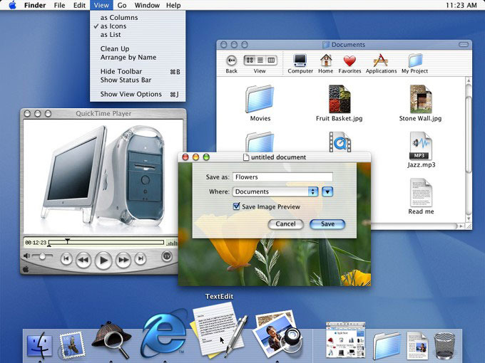
To start off, I will explain how Frutiger Areo developed. At the start of the new millennium. Thanks to the progress of technology, operating system manufacturers could experiment with better, more innovative user interfaces that would make using computers easier and more pleasing than ever before. The first example of this is when on March 24, 2001 Apple released Mac OS X 10 with a new user interface called Aqua, which made heavy use of reflection effects and translucency.
As indicated by its name, it was based on the theme of water. Its first appearance in a commercial product was in July 2000 with the release of iMovie 2. A very innovative interface at the time, it would inspire other manufacturers such as Microsoft to pursue similar-looking interfaces.
In 2001 also, Windows XP would be released with the Luna theme, which looked more friendly and playful than previous iterations of Windows (which some people didn't like, they would call it Fisher price-looking), it was very colorful, with blue being a prominent color, unlike 9x which was more dull-looking and gray in color.
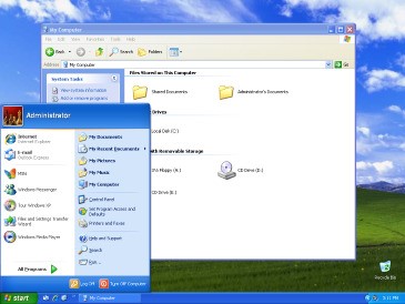
Every copy would ship with the Bliss wallpaper by default, a green hill with a bright blue sky that almost feels dream-like. It was photographed by Charles O'Rear in a vineyard in Sonoma County, California. The widespread use of Windows XP with Bliss in the years to come would contribute heavily to popularizing the use of abstract nature and greenery in tech, advertisements, photos, posters, etc.
Unlike the 1990s, where aesthetics looked more gray and cyber-futuristic (retrospectively called the Y2K era), things started to look more colorful. There was also a heavier emphasis on nature as people started to be more aware of the dangers of climate change.
Around the same time, HD Television and new display technologies such as Plasma TV were also starting to take off in popularity, and vibrant, abstract photography and videos of nature and the ocean would often be displayed in stores and advertisements to show the full capabilities of the displays. Analog TV would also give way to Digital TV, which increased image quality for millions of people.
The year 2005 is when Frutiger Aero truly started developing as an aesthetic of its own, detached from Y2K. Notably with the creation of the Windows Aero visual style in Windows Vista build 5048 by Microsoft, replacing the previous Luna theme used in Windows XP. The Windows XP Media Center Edition 2005 also featured an interface closely resembling Aero.
Here's a few words on Windows Vista build 5048 and the use of Aero:
"The user interface has seen a gradual overhaul over previous builds; although parts of the interface are largely similar to its predecessor, a number of changes can be observed across various surfaces. The Windows Aero visual style, which sports a design featuring shiny metallic and glass surfaces, has been added to the operating system; it is the default system theme throughout the rest of Vista development and would act as a complete replacement for the legacy Luna visual style, initially present as a development placeholder in builds up to 5059 (vbl_wcp_avalon). ClearType anti-aliasing is now enabled across all surfaces by default." [quote]
The Windows Vista Developer Center also defined Aero this way:
"What is AERO? AERO stands for Authentic, Energetic, Reflective, and Open and is the user experience guidelines for Windows Vista, governing the look and feel of the operating system. These guidelines express not just the way the pixels are drawn, but how the user interacts with the system and the feelings it should evoke. These guidelines, and the AERO user interface, are the result of years of design and user research by Microsoft." [quote]
 Longhorn build 5048
 Mac OS X 10.0 (2001)
(2006-2011) Golden Age

In 2006, Frutiger Aero-style stock photography is flourishing. This time period is when a lot of the iconic images would be created. This can be seen in the Korean Asadal website, who made thousands of such images.
Another notable example is the Sozaijiten (素材辞典), which translates to Material Dictionary, a Japanese-produced collection of stock images made by Image Navi Corporation, spanning over 246 volumes on various subjects, some of which contained Frutiger Aero imagery, often depicting nature and cities merging together, reflecting a vision of a more optimistic, eco-friendly future.
On January 30, 2007, a new operating system would make its appearence: Windows Vista. After a troubled development and numerous delays, it officially released to the public with the Aero visual style. The new look was pretty demanding on the hardware of the time, and a lot of computers not reaching the minimum requirements were sold with Vista pre-installed, resulting in a slow, laggy experience for a lot of people.

There were also other technical issues within the operating system, and other annoyances that frustrated users. This was fixed later on in the service packs, but by then, the damage to its reputation was already done. Microsoft showed this in the Mojave experiment, which showed frustrated XP users being shown the "new version of windows", which was actually Vista, and being impressed.
Despite heavy criticism because of technical errors and aging hardware, the OS was praised for the beauty of its interface. It featured blurred, transparent glass on the window frames, taskbar and start menu, dynamic light effects, more defined fonts, and new features like the Search bar in the Start Menu.
Windows 7 was released on October 22, 2009, and immediately found huge success. It fixed many of the issues and frustrations users had with Vista, and by that time, users had more capable hardware. It is still regarded by some (me included) as the best version of Windows, because of its beautiful interface, simplicity, and user-friendliness.
During this time, most of the big tech corporations had embraced the new design aesthetic, and it was everywhere; advertisements, television, stock imagery, websites, media, and tech gadgets of all sorts. An example is the iDog robot dog, which featured the ability to receive music from an MP3 player or iPod and dance to the rythm.
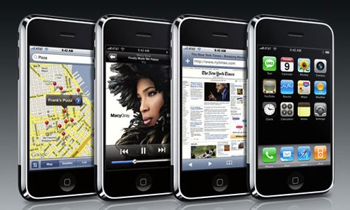
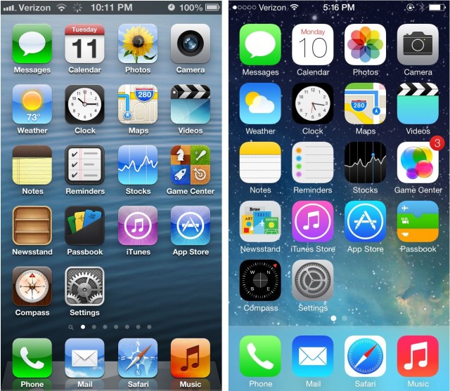
When Apple launched the iPhone in 2007, it made heavy use of skeuomorphism, a design concept of making items resemble their real-world counterparts, in an attempt to make the UI more intuitive for people not yet used to smartphone technology.
"The skeuomorphic design approach was a hugely debated topic inside Apple back in those days. Apple iOS SVP Scott Forstal pushed for the design direction, while legendary industrial designer Jony Ive and other Apple top-level executives were against it" [quote]
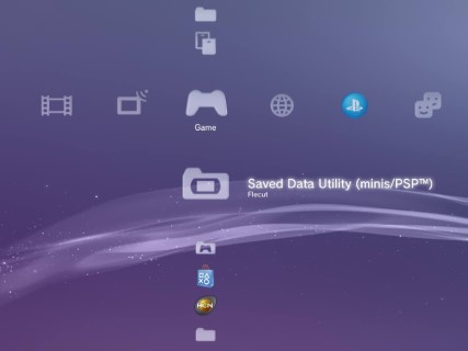
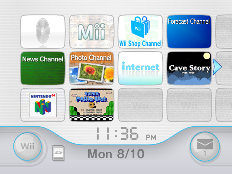
The seventh generation of video game consoles also started using Frutiger Aero designs for their graphical user interfaces. The Wii, aimed at more casual audiences, introduced motion controls, and a playful interface using skeuomorphism, all this accompanied by soothing music. The PlayStation 3 and PlayStation Portable also featured their own interesting and beautiful interfaces, with Aurora Borealis backgrounds, like Windows Vista. The Xbox 360 dashboard is also worth nothing.
In 2011, The PlayStation Vita was released, which perfectly encapsulates the Frutiger Aero aesthetic: Skeuomorphism is heavily used, and the home screen uses floating bubbles as navigation items. Sadly, the console was a commercial failure, which also led Sony to abandon the handheld console market.
 Sony Playstation 3 (2006)
 Wii (2006)
(2012-2013) Downfall

In 2012, smartphones and tablets were more popular than ever before, and the future of traditional computers was unknown. Microsoft saw this and wanted to accommodate this growing user base in their next operating system: Windows 8.
The new OS would look completely different from Windows 7, ditching the Aero design language for Metro, which featured a flat and minimalistic look. The desktop environment was composed of tiles to make it easier to navigate for touch-based devices. The OS was confusing for most PC users, used to a more traditional interface. There was still an option to show the regular desktop instead of the tiles, but the start button was absent.
Due to backlash, Microsoft would later bring back the start button with the release of Windows 8.1 in August 2013, but most people did not want to use it, choosing to remain on Windows 7. Despite this failure, the industry started to shift towards flat design and drop Skeuomorphism and other more elaborate designs.
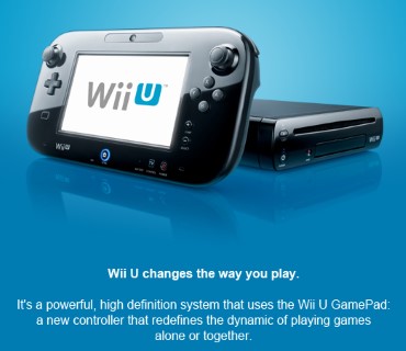
The Wii U, released on November 18, 2012 by Nintendo, was the last game console to feature a Skeuomorphic interface. But due to a number of factors, it would be a commercial failure, only selling 13 million units.
In 2012, Scott Forstall, who led the original software development team for the iPhone and the iPad, was fired, and Jony Ive and others took over the design of iOS. On September 18, 2013, Apple released iOS 7, which had a new look, featuring sharper, flatter icons, and slimmer fonts.
Jony Ive, Apples's head of design, said this:
"the new icons feature a new palette of colors — gone are the bold, primary colors of old, replaced by modern shades and tones. Flat design is very prominent in iOS 7 — everything from the buttons to the switches to the chrome surrounding apps has been modernized and flattened. Apple says that the new design makes your phone "appear bigger" because each app makes better use of the screen real-estate available to it. The calendar, phone, messages, Game Center, and others have all lost their skeuomorphic designs and now feature clean, flat layouts. The signal bars in the upper left corner of the phone have also been replaced with a series of dots." [quote]
He also made this comment about it:
"There is a profound and enduring beauty in simplicity, in clarity, in efficiency. True simplicity is derived from so much more than just the absence of clutter and ornamentation - it's about bringing order to complexity. iOS 7 is a clear representation of these goals. It has a whole new structure that is coherent and applied across the entire system." [quote]
Due to all these events, Frutiger Aero lost popularity and was gradually replaced by simpler, flatter interfaces, and less elaborate designs. Which is also cheaper and faster to produce.
 iOS 6 to iOS 7 (2013)
 Advertisement for the Wii U
(2017) CARI defines Frutiger Aero
In 2017, Sofia Lee (known mononymously as Sofi) from CARI, which stands for "Consumer Aesthetics Research Institute", an online community dedicated to developing a visual lexicon of consumer ephemera from the 1970s until now, coined the term "Frutiger Aero", they define it as "the corporate tech aesthetic popular from approximately 2005 through 2013."

With prominent motifs being (I quote):
- Skeumorphism in UI/UX design
- Glossy design
- Frutiger/humanist sans-serif typefaces
- Tertiary color palettes
- Glassy/transparent materials
- Photographs of aurora borealis
- Bokeh photography
- Macro photographs of grass
The first part of the name "Frutiger" is derived from the Frutiger typefaces, designed by Adrian Frutiger, and the second part "Aero" is derived from the Windows Aero design interface.
There are also other sub-aesthetics or sub-genres of Frutiger Aero that the community has defined, such as Frutiger Eco, Frutiger Aurora, Dark Aero, Technozen, Helvetica Aqua Aero, and more (see picture below).
 Frutiger Aero vs Y2K
 Frutiger Family and other aesthetics
(2022) Revival on Social Media
Frutiger Aero regained popularity around 2022 thanks to social media, people that were kids when it was popular, now being adults, are returning to the aesthetic, but also younger people that were not around still enjoy it.
It will probably never become mainstream again as a design trend, however nothing prevents you to create cool artworks, wallpapers, music, and theme your computer to look Frutiger Aero, to celebrate the good old days, or simply for the love of art.
Join these cool places to find other people that like the aesthetic: