
Welcome to the Archive ! This is a passion project dedicated to an aesthetic from the 2000s that I love. I hope that you will enjoy the website and find things that are useful to you.
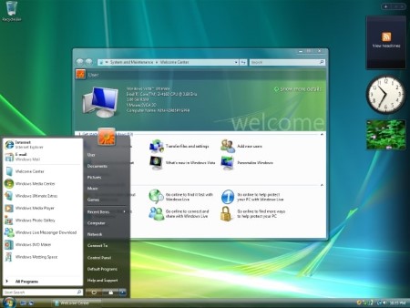
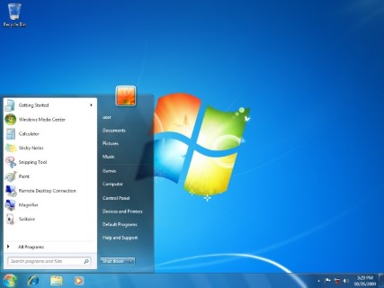
Frutiger Aero derives its name from the Frutiger fonts designed by Adrian Frutiger, which inspired the Segoe UI fonts, and Aero, an acronym for "Authentic, Energetic, Reflective, Open", the visual design and user experience guidelines of Windows Vista and Windows 7.
Sofi Lee of the Consumer Aesthetics Research Institute coined the term in 2017. It's the opposite of Flat Design and Minimalism, instead of simplified logo designs, Skeuomorphism is used, a concept of making items resemble their real-world counterparts, and instead of being flat, designs tend to be 3D and are generally more elaborate. You will find plenty of examples by navigating this website.
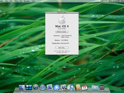
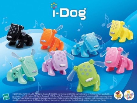
Other notable elements of the style are bright and vibrant colors, glossy textures, glass/transparent materials, aurora borealis, bubbles, bokeh, macro photographs of grass, futurism, and humanism. Scroll down to see a few examples of Frutiger Aero.